Assignment 1: Natural forms
natural forms – finished drawing
One thing this first assignment taught me – it would be possible to plan forever. Past a point, however, planning becomes procrastination. Eventually, it’s necessary to put pen/pencil/pastel/tool of choice to paper. I made a start by drawing up a basic map of what I wanted to cover.

initial plan
All the points mentioned might seem obvious, but assignments have a strange knack of wiping the brain clean of common sense, it appears, and I wasn’t leaving anything to chance.
The forms I opted to draw were a collection of objects gathered on a walk in the woods – a large branch, a dried flower head, some dried bracken, and a couple of pine cones. I began by making a series of quick pencil sketches in my sketchbook, trying out various arrangements.

first composition sketch
The close zig-zagging lines were to indicate where the shadows fell. In the first sketch, I felt everything was a bit too cluttered. The second composition sketch was even more so…

2nd composition sketch
By the third sketch, I thought I’d cracked it.

3rd composition sketch
The arrangement felt less cluttered, although I still wasn’t entirely happy with the way the flower head obscured some of the shadows. However, I decided to continue planning on a separate sheet, keeping an open mind about composition.

A2 planning sheet
This was the first time I’d used a large sheet for planning in this way, having worked on individual pages in my sketchbook previously. I found it helpful to have this kind of overview, especially as working through it was what changed my ideas on the final composition. Had I gone straight in to the drawing, I would have had a lot more work to re-do.

coloured pencil sketches
I started by making a few small sketches in coloured pencil, testing colours and seeing how well I could represent various aspects of the composition in this medium. It worked fairly well, but I thought it might end up making the finished piece rather less fluid than I wanted it to be.

charcoal sketch
Next, I tried sketching part of the branch in pastel pencil, and the bracken in charcoal. I didn’t think the charcoal would suit this arrangement, and just this cursory test confirmed that. The pastel pencil wasn’t too bad, but the colours I have were limited and not really suitable.

watercolour and ink
I then tried a few little sketches in watercolour and ink (both Indian and water-soluble). The effect of the Indian ink was too harsh for my liking, but I did like the water-soluble ink. It still looked more illustrative than I wanted it to, though.

watercolour and ink
I did like the effect of the watercolour, however. It allowed the most fluid effect, which seemed right for this subject. I particularly liked the blue-grey shadows.
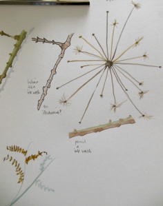
watercolour flower head
The one element I was most concerned about depicting was the dried flower head. It was so delicate, and my quick watercolour version (above) didn’t bode well for the finished article.
pencil sketch
Next, I drew a small pencil sketch of what I thought would be the final arrangement (minus shadows, as I wasn’t planning to draw them in pencil, painting them directly in watercolour instead). I then painted this sketch (see below).

painted sketch
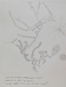
Once this was completed, I felt that the arrangement was still too cluttered at the point where the flower head was situated. I drew another quick pencil sketch in my sketchbook, having moved the flower head further back on the left hand side.

pencil sketch of the final arrangement
As I noted in my sketchbook, switching this element transformed the picture from landscape orientation to portrait. The relationship between the individual objects felt better in this layout – more room to breathe, and less of a tangle in the shadows.

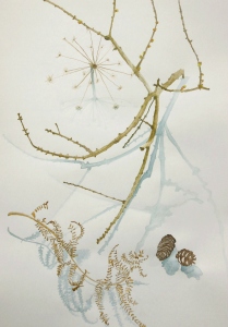
natural forms
The above photo shows the lighting of the composition, although it doesn’t quite reflect my viewpoint (which was slightly higher than shown here). I had placed the objects on a large white sheet of paper, so as to see the shadows more clearly.

bracken detail
The bracken (above) was quite a daunting prospect, but I found that it was easier to draw than anticipated. I developed a swirling, irregular ‘figure eight’ pattern to apply it. I wanted to recreate the lightweight feeling of it, and the curling crispness of the drying leaves, and hope I’ve managed this through varying tone.

flower head and branch detail
The branch took by far the longest time to do. I think this was because the widths, textures and features of it changed all the time. After the painting was finished, I went back into it with the pencil, and worked on building up texture using a combination of squiggly lines and irregular dashes. It took a while to observe the angles closely, too. I found that studying the negative spaces helped a lot with that. As feared, the flower head was a bit of a disaster. I tried so hard to convey the curved ‘umbrella’ shape of it, but I’m not sure I was successful. It was difficult to depict the ‘barely there’ nature of the tufts on each of the spines. The stem of it was severely foreshortened too, and I struggled to draw it as short as I was actually seeing it. I think I did eventually, though. I painted the shadow in darkening graduated tones to indicate the closer proximity of the stem to the paper. I did the same with all the other elements that were nearest the paper, too.

pine cones and bracken detail
It was interesting to note the differences in the pine cones, just viewing them from slightly different angles. They had the most varied tones in their shadows, too.
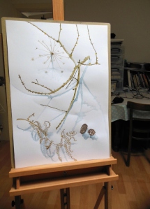
finished picture
Finishing was almost as hard as starting. It’s tempting to carry on, tweaking here and there, but I felt this was the right point at which to stop. I’m not sure the result was what I set out to do, but I quite like its sparseness. Being the first assignment, this is a bit like walking into a mist… no idea what’s coming, but hoping I won’t fall flat on my face.
I love the final piece, especially the shadows. Interesting to read the journey there too.
Thanks, John. I did have a moment of concern about using watercolour, but I think it works as a drawing medium (as much as ink washes, for example). Glad to have one piece completed at least!
I think this is really lovely, Mags, and love the story telling too.
Thanks so much!
Your finished painting is beautiful, and I loved seeing the process behind it.
You’re right that it’s not always easy knowing when to stop – and watercolour is so unforgiving if one goes too far. Lovely work.
Thank you, Lynn – much appreciated. It’s quite a trick, learning to know when to stop. I dare say one develops an instinct for it, eventually (or so I’m hoping).
I really liked your finished work – loved the use of colour and also the unusual choice of composition and medium. Well done.
Thank you, Margaret – that’s kind of you. I wanted to restrict the palette as much as possible, as the forms seemed to be the thing here.
Lovely spiky / fragile contrasts in a delicate drawing. Well done!
Thank you! The contrasts were a large part of the appeal, so I’m pleased that comes across. 🙂