Assignment 1: Made objects
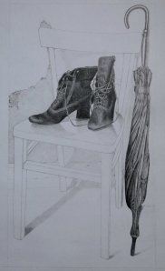
~ finished drawing
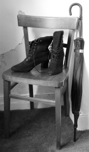
I’d had the idea for what to use in this drawing some time ago (and actually wrote it down at the time… a practise I’m trying to adopt increasingly). The boots struck me as interesting forms, with a fair degree of detail. Together with the umbrella, they offered a subject strongly characteristic of me, which felt important. Something familiar. However, although the objects had been in mind for a while, the medium I eventually used was a complete surprise. Initially, I saw this as a loose charcoal drawing. As you can see, it evolved into the antithesis of that!
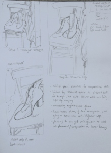
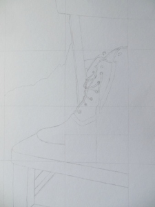
compositional pencil sketches
I began by making a number of compositional pencil sketches in my sketchbook. I actually had a clear idea of the arrangement, but it was the format and cropping of the composition that I wanted to investigate. The first sketch (top left) used a straight rectangular format, cropping in to a certain extent, with the objects extending beyond the edges of the paper. The second sketch was taller and narrower, whilst the third cropped tightly, focusing on just one boot and no umbrella. Of these, the second one fitted the image in my head most closely, and I liked the layout in practise. Also, I was bearing in mind that the course book had cautioned against always resorting to the standard rectangle.
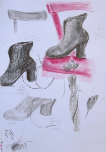
charcoal, pastel and pencil studies
I was limited by restricted space as to where I could set up objects and sit or stand back far enough, but this worked well with the tall narrow format upon which I decided, as there was a small recess in the bedroom, where the objects fit perfectly. There was added interest from a section of torn wallpaper in the background, currently awaiting redecoration, and I thought I’d make the most of the opportunity while it was still there. The composition was lit by natural north light coming in from the left hand side.
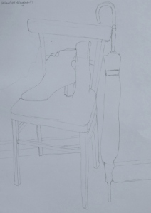
partial pencil sketch
I then moved on to testing different mediums on a separate A2 sheet. As I mentioned above, my initial idea was to work in charcoal, in a loose manner. However, when I came to try this out, I found it didn’t work well for these particular objects. I tried both willow and compressed charcoal, and hard pastels, and wasn’t happy with the effects these created – particularly around the ‘eyes’ of the boots. In addition to this, I found it hard to lift out small areas of charcoal cleanly with the putty rubber. Out of frustration, I picked up a pencil and started sketching a small detail of one of the boots. To my surprise, I found I liked it, and decided to try pencil for the finished drawing. In this way, I found yet again that the preparatory sheet of studies proved its worth.
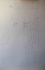
enlargement grid
I made a partial pencil sketch in my A3 sketchbook, to get a feel for how it might work on a larger scale. As a side note, it was interesting for me to work in pencil as it’s a medium I tend to avoid quite often. I don’t even use it in life drawing unless asked to do so. Once I felt confident that it would work, I decided to use an enlargement grid to draw the full-size version on A2.
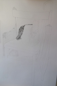
completed enlargement
This was fast turning into a surprising project – pencil rather than the anticipated charcoal, and now the introduction of an enlargement grid, which I had believed until just a week or so before would be of little use to me. I took a photo of the arrangement and used a photocopy of it to draw the grid on. Again, I found the business of working out grid ratios rather complicated, but once I started to transfer the outline drawing to the A2 sheet, I could see that it was going to work quite well. I was especially pleased with the negative spaces in the composition. I then referred to the objects themselves for the finer details and for the tonal information.
tonal shading
I used as much of the A2 sheet as my chosen tall narrow format allowed (most of the height, with some bordering at sides – just visible in the photo above). I wasn’t sure whether or not to cut off the borders, and eventually decided to submit it for my tutor’s assessment with them still intact. However, I think it would probably work better with them cropped off.
I then began the lengthy process of tonal shading. I started by putting in the detail on the wall – the torn paper, and rough texture to the left hand side – before moving on to the boots and umbrella. Both proved laborious, but really enjoyable, and I particularly relished building up the darker tones. I worked from left to right as much as possible, in order to avoid smearing the graphite, and used a sheet of paper to rest my hand against where I thought that might be likely. I noticed that I varied the ways in which I was holding the pencil, often grasping it loosely in the centre, especially when working on broader areas of tone. I was also aware of the direction of my pencil strokes, and changed it depending on the ways in which the individual parts of the objects were shaped, in order to indicate how the light fell upon them.
I had quite a clear mental picture of the boots and umbrella being the main areas of focus, and for that reason chose to draw the chair as a ‘blank’. In particular, I recalled the research on Patrick Caulfield earlier in the course and was keen to explore the contrast of the flat shape of the chair with the fine detail of the main subjects. I tried to vary the outline of the chair, using bolder lines for the areas that contrasted more strongly with the background, although I’m not sure how evident this was in the final picture. The shadows cast on to the floor and walls were the last additions, and I’m not sure how well they worked. My original idea, inspired by Caulfield, was to not have any shadows other than those within the boots and umbrella, but the boots in particular felt they needed to be anchored by some minimal shading. Would it have been better to have omitted them or not? On balance, I think they did serve a purpose. I deliberated whether or not to add shading or texture to the floor (carpet), but felt it might detract attention from the focal points. I was guided in this by the advice in the course book to work selectively – ‘select only those features of the group that strike you as being important’.
Overall, I was pleased to have made reference to so many elements of part one of the course in this drawing – enlargement, composition, tonal variation, negative space, Patrick Caulfield, contrasts, tone and form, holding the pencil, texture (wall, torn paper, and the brushed suede-like fabric of the boots), hatching (albeit minimal, in the shadows), and reflected light (in the umbrella handle). I was happy with the fluidity of the drawing and the degree of detail and contrast and felt that the subject suited me. Also, I liked it as a composition, although I don’t know much about the technical aspects of that as yet. I think it was quite an unusual arrangement and it interested me.
arrangement of made objects
This is beautiful, Mags – it has a very Victorian atmosphere.
Thank you, Lisa…much of what I have seems to fit that description!
Hello Mags,
Welcome to the wonderful world of graphite 🙂
This really is a fantastic work. You must be quite proud of it – I know I would be.
Superb in every way.
Stew.
Thank you, Stew! It’s funny, I’ve always been rather fearful of the pencil – it doesn’t offer anywhere to hide. But I really enjoyed doing this, time constraints aside. I think I may have fallen in love with my 4B and 5B pencils…. 🙂
Lovely tonal contrasts and a strong sense of narrative. Well done!
Thank you very much!
Hi Mags,
I really like this picture, the composition is very strong and it shows just how important your first sketches were to develop the picture. I also think the way you left the chair as a simple line drawing was really brave but it works so well.
Thanks for that, Jayne. It was a little nerve-wracking, leaving the chair blank, but it felt like the right thing to do, so I had to trust my instinct.
Stunning !
Thank you very much, Vanessa! I hope you had a good trip?
Oh, yes fantastic. Very little drawing but that will follow. Will email you my short diary of bangla trip … only to read if you want to of course.
I’d really like that, Vanessa… thank you!
Hi Mags, I’m just looking through some of your stuff and enjoying reading through the detailed description of your progress through these projects. I really like your boots > especially like the added flash of pink chair in one of your drawings.
I appreciate that, Pam – thank you. It can be hard to gauge how much of the process to write!